How to Make ADA Signs More Interesting
Let’s get real for a second. ADA signs are boring. These types of signs are mostly regulatory and functional meaning that they are not really intended to be visually appealing. The text must be easily readable, the background must contrast with the foreground, the sign itself must be installed in a specific location, etc. These restrictions mean that there’s not a lot of room for creativity. Going against the guidelines stated in the ADA can lead to possible legal action against your organization. The environmental design of an indoor or outdoor shared space is important for everyone’s experience, so how can you make your ADA signs more interesting and appealing? Here are some ideas:
 Experiment with Visual Contrasting Textures
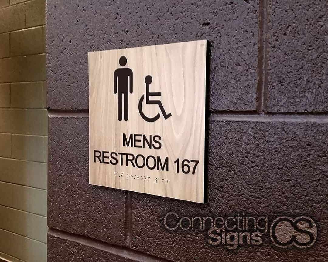
ADA signs are signs that need to communicate important messages in the most available and accessible way. Braille is required on these signs to ensure that people with visual impairments can feel and interpret the message. As a general rule for communicating visual messages, you need to use contrasting background and foreground colors to ensure that people can clearly read the sign. Contrasting textures are another way to create clear visual legibility. Even though ADA-compliant signs can not have actual textures (the backer of the sign must be a smooth matte finish), you can use specialty laminate to create the effect of texture.
Incorporate a Color Scheme that Really Stands Out
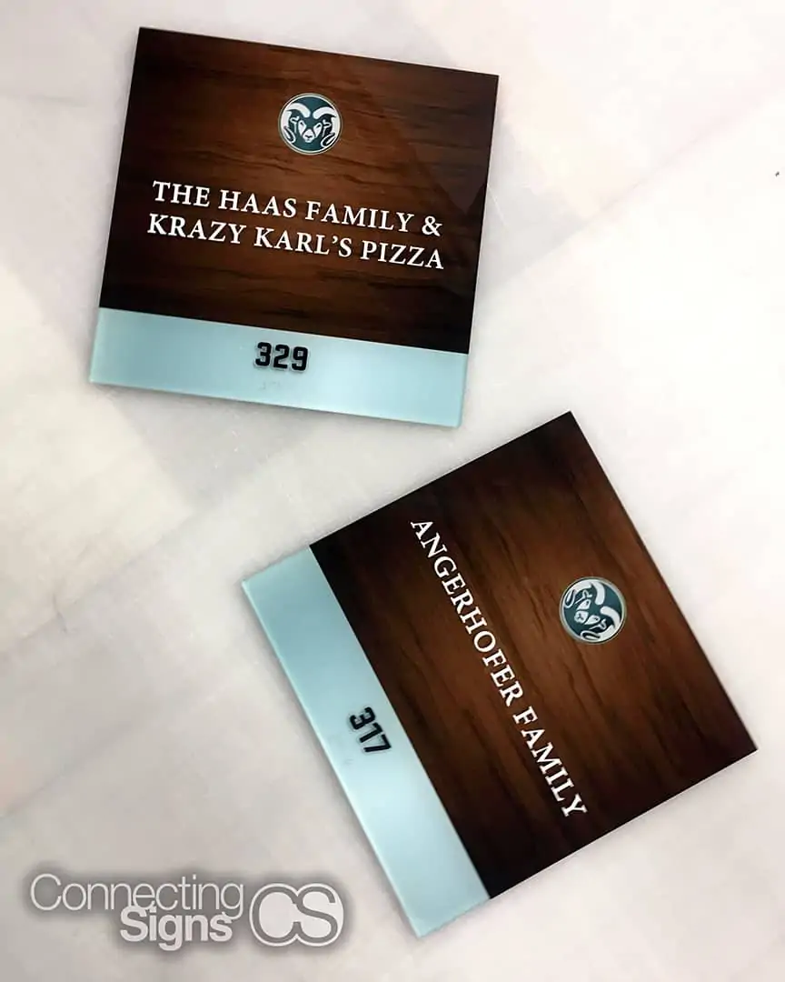
If there’s any way to help words on a sign visually stand out from its surroundings, it’s the color scheme. The obvious route is to use light-colored letters placed on a dark background. White letters on a black background is the best color scheme for high visibility. However, a black and white color scheme does not lead to a very visually interesting sign. Make it interesting and complementary to the environmental design of the space by picking dark and light colors from the surroundings. A good brand should also provide a color scheme within their branding guide, so you could select your ADA sign colors based on that information.
Experiment with Layers to Create Depth
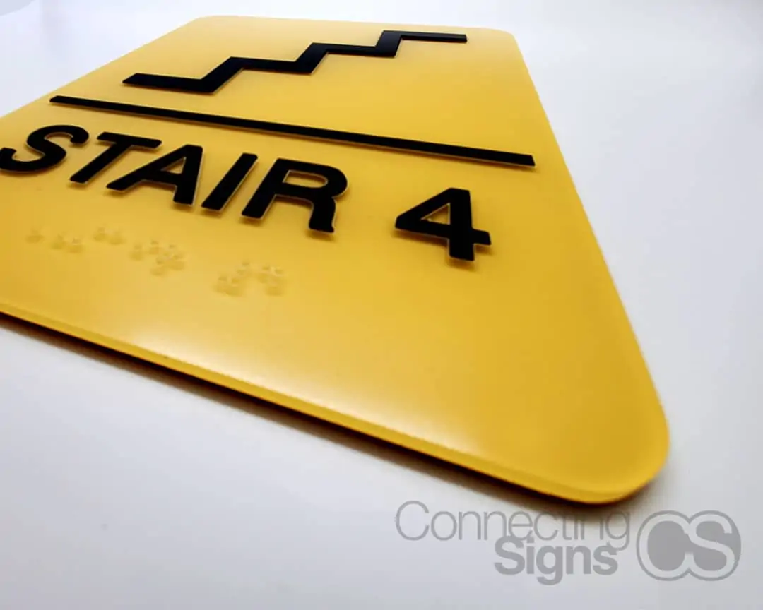
Standard ADA signs are constructed with a single acrylic backer with raised tactile letters and clear braille dots directly underneath the line of text. That is how you make a basic compliant ADA sign but if you want to make it more interesting, you can build from that base template. Adding another acrylic backer that is cut into a unique shape creates a frame around the basic sign which allows it to stand out better. You can also create an interesting shadow by installing the sign with standoffs instead of sticking it directly to the wall.


