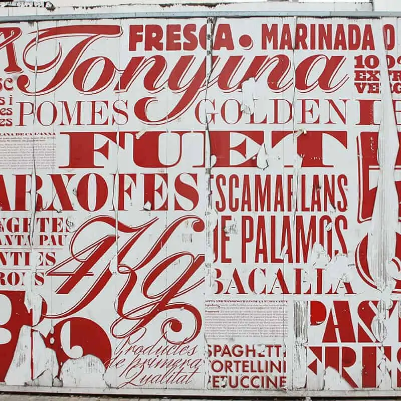
Graphic design is the process of communicating and problem solving using visual symbols, typography, photography, illustration, and layout principles. Graphic design for signage is purely functional as each sign is meant for a specific purpose. Some signs are created specifically for advertising purposes and some are created to answer frequently asked questions. If you’re interested in designing your own signs, there are a few basic guidelines to keep in mind. The following points about sign design are based on the past experiences of working with multiple businesses, clients, and other graphic designers.
Appreciate Your Audience
Before you even start your sign design, put yourself in the shoes of your audience. Understand that they may not be as informed as you about your business so you may need to consider simplifying your sign design. Consider how your sign will look to someone who has no idea what your business does. How do you ensure that your message is understood? Be specific, be direct, and always keep it simple! Another important part of understanding your audience is knowing how they will be viewing your sign. Will they be driving past your sign at 75 MPH on the highway? That means that your audience will have one or two seconds to understand your message so plan your design accordingly.
Pick the Right Type of File
The most frequently asked question from clients looking to send their own artwork is: “What type of file do you prefer?”. The preferred file-type is almost always a .PDF but it sometimes depends on what type of sign the client is ordering. If you’re using a software program to create your artwork, make sure you’re using a professional design tool like Adobe Illustrator or Photoshop. Further, understanding the difference between raster and vector graphics is vital especially for large format digitally printed signs.
Understand the Difference Between Raster and Vector Graphics
Raster graphics are images that cannot be enlarged without pixelation occurring. They can be edited with special software applications like Adobe Photoshop, but you will need to have a good understanding of how resolution works. Raster graphics are usually small files that are ideal for photographic prints and website imagery. Vector graphics are graphics that are defined shapes with lines and points. Vector graphics can be enlarged to any size and printed without any trouble. Vector-based graphics are also the only way to create cut vinyl decals as the digital plotter needs to read the lines and points within the file to plot them out onto the sheet of vinyl.
Use Contrasting Colors
Ensure that your message is clear and attracts attention by using contrasting colors for the background and foreground. From our learned experience, the best color combinations for signage is a black background and white text or white background and black text. The worst color combinations are lightly-hued text on a lightly-hued background or dark-tinted text on a dark background. Color theory explains how primary colors mix together to create secondary colors, and how different combinations of those colors become intermediate colors. Understanding color theory, color schemes, and how colors affect people psychologically is a good idea if you’re designing multiple signs that need to have a cohesive design.
Choose Easy to Read Fonts
Another important part of sign design is selecting the appropriate font to feature your text in. The general rule is to keep the number of fonts to a minimum and to not use more than two different fonts in one design. Sans Serif fonts are easier to read than Serif fonts when it comes to signage; this is why highway signage always features sans serif fonts. Consider the hierarchy of information in your sign. What do you want your audience to do if they need your product or service? Having a bold, upper case call-to-action could be the best way to get them to take a desired action.
Utilize Negative Space
Too much text, photos, and graphics will actually deter people from your advertisement. It might seem like a good idea to include as much information as possible on a sign, but that can lead to a cluttered design which overwhelms the viewer and leads to information being overlooked or ignored. Negative space (intentional blank space) in a sign design layout helps the reader understand the message being communicated by singling out vital information and giving the reader’s eyes a break.
Always be Aware of the Rules
Some types of signs, like ADA restroom signs, are required for public and commercial spaces. There are a lot of rules for the design of interior ADA signs, like the letter height and pictogram design. Ensure that your signs are compliant by following ADA sign guidelines. Further, be aware of the local sign code for large exterior signs, like illuminated channel letters, to ensure that you don’t waste money by buying a non-compliant sign that will be removed (at your cost).


