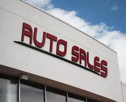
A sign’s job is simple. It tells customers or the general public who you are, what you do, where you are, and how to contact you. A sign is functional and completely necessary in terms of establishing an identity or brand. A sign’s job is never-ending. Workers clock out at 5, but a sign works 24 hours, 7 days a week, 365 days a year.
Since a sign is so important, might as well make it attractive and easy to read. And while you will want your sign to stand out and be original, you don’t want to stand out for the wrong reasons. Here are the top 5 sign design mistakes you should avoid.
- Do not use a business card design as your sign. Signs need to be direct in the information that they are providing. Using a business card layout for a sign usually crowds the sign and makes it hard to read. When you are driving by businesses at 45 MPH you don’t have time to read their tagline and mission statement. You’re looking for a service and a logo/name. Keep it simple.
- Do not use a refurbished piece of plywood or metal as your sign. Even if you paint and re-finish the piece of plywood, that finish will not last long. Within a year you could find yourself in deep trouble with the upkeep of that sign. Having a permanent sign made out of the right materials will cost more, but is an imperative investment if you want to be taken seriously.
- Do not use a banner as a permanent sign. While a vinyl banner is inexpensive and works well for advertising specials or temporary information, you shouldn’t use it as your permanent sign. If you, as a business owner, want your business to be taken seriously you need to look into investing in a permanent, sturdy sign.
- Do not use light colors on a white background or dark colors on a black background. These designs may look great close-up, but step back and imagine moving past your design in a moving vehicle. The chart at the end of this article is good to use for picking color combinations.
- Keep the whole design of the sign SIMPLE, the design of your sign relays an instant, functional message to the viewer. A graphic design professional that is trained in advertising and effective sign design will get the proper message displayed.
- As budgets allow, show your potential customers how serious you are in your business – Lighted channel letters, an architectural monument sign, exterior dimensional letters mounted to your building – these are all types of signage that show everyone, including your competition, that you are in the business for keeps! Potential customers see the business as a stable and trustworthy establishment that they want to do business with.
Connecting Signs is your trusted partner in Northern Colorado for all signage needs. We specialize in large format printing, vehicle graphics, interior directional sign panels, ADA signs, lobby signs, banners, monument signs, and dimensional letters.
Contact us and we’ll be your trusted partner to get your business the attention it deserves. We truly believe that the only way for us to be successful, is if your business is successful!

